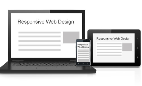
Responsive web design, a term popularised by designer-developer Ethan Marcotte in his essay of the same name, is an approach to web design whereby a page display will fluidly adapt to the environment its being viewed within. It has unarguably improved the mobile web over the last couple of years.
Although spearheaded commercially by digital-native brands and design-conscious publishers, it is by no means a universally favoured approach to web design and has caused a great deal of debate in digital design circles.
For visual designers, nearly everything starts with the grid – that is the grid of lines that the various elements of a design are laid over. For responsive designs, the grid not only provides structure to a composition and aesthetic consistency, it enables a breaking down of its elements into smaller parts.
If you’re looking to build something that works across various screen sizes, a responsively designed site makes for a sensible option. Briefed with what screen sizes users’ devices are likely to be, a designer can work on a grid that is tailored to specific ‘breakpoints’, the size at which a design should reconfigure itself to the next template up or down the scale of screen sizes.
But in a piece on responsive design for Wired magazine, Typecast’s Paul McKeever urges designers to “design for the reader, not the device”. Transposed from traditional graphic design, where they are used to dividing an area of known proportions (e.g., a page of A4 paper) into smaller units, grids help establish uniformity throughout a design. “But on the web,” says McKeever, “we’re designing for a medium that doesn’t have fixed dimensions. Resizing a layout using an arbitrary grid system no longer makes sense.”
Like responsive design, content marketing is also all about context, and it is the web that is powering it, yet where is the talk of confluence between the two?
On the site A List Apart, McKeever’s colleague Chris Armstrong offers an alternative, explaining that it is content that the web is built around, and not form. Their campaign is one that calls for responsive designers to adopt an “infinite grid”, thinking aligned to writer and responsive design pioneer Mark Boulton who, in his 2011 essay A Richer Canvas suggests that designers need to shed the notion that they create layouts determined by the size of a canvas. “We need to flip it on its head, “ he says, “and create layouts from the content out.”
McKeever and Armstrong expand upon this argument, asserting that as most of that content is text, grid proportions for responsive design should be based on type, rather than the size of the space that the content will be presented in, given that this is increasingly indeterminable. “After all,” he adds, “how can you know where a design break is if you haven’t settled on the font, its size, height and measure?”
However, even though the user is still right at the heart of it, there is an important element missing from the majority of responsive design discussions, and one that directly affects brands and marketers, who should ensure that they’re involved in the conversation in a meaningful way.
After all, the design protocols being debated have major implications for their customers. Surely if responsive web design is about content and user context, then messaging and functionality should take an equal importance to aesthetics. If type is to be the foundation of web design, what of words themselves?
In an article for Aeon Magazine, author and digital commentator Tom Chatfield explores how the human population is now more literate than at any time in history, and, thanks to the internet, writing forms an increasingly important means of communication, not just for the educated elite, but for 84% of us, in many instances replacing or outstripping speech itself. If responsive design is the topic of the moment in design, content marketing is its counterpart in the world of brand communications.
Although by no means a new concept (it’s as old as writing itself), thanks to this increase in global literacy and connectivity (according to Nielsen, almost 2.5 billion people were online last year), the potential reach and relative inexpensiveness of content marketing, along with the rise of social media and increasingly marketing savvy audiences, has placed it at the forefront of many brands’ consumer-facing activity.
Like responsive design, content marketing is also all about context, and it is the web that is powering it, yet where is the talk of confluence between the two? Brand strategists and product marketers should be sitting down before embarking on new digital projects with not only their designers and front-end developers, but content producers and back-end developers too. Together they can figure out how to apply the principles of responsive design and its emphasis on context holistically.
Imagine a website that not only adapted aesthetically to a user’s situation, but functionally too. In a recent piece for Brand Perfect, data management expert Aliya Whiteley looked at the untapped potential of geo-tracking and digital maps for brands, and how some innovative brands, such as Mercedes-Benz, are breaking new ground, by beginning to integrate Google Glass – which will surely lead us to the next iteration of our digital lives – into their brand services.
Assuming Google Glass takes off as expected (and no doubt competitive products will also join the market), and considering the huge leaps in advancement being made by other applications such as Siri, Apple’s speech recognition software, audio as well as visual communication is growing in importance to our digital lives.
As this evolution continues, for brands to connect with audiences, they need to ensure that the ‘responsive web’, although capably led by pioneers in visual design, goes beyond it.