Internet access through mobile devices is accelerating – and has led to a corresponding increase in searches from smartphones and tablets. Google itself has reported that in ten countries, including the UK, more searches are now happening on mobile devices than on desktops.
To cater to this change in behaviour, Google has been encouraging brands to ensure that their web pages are ‘mobile-friendly’ i.e. deliver a good user experience when viewed on mobile phones.
The search engine authority published a set of guidelines covering areas like:
- Avoiding software that is not common on mobile devices, like Flash
- Using text that is readable without zooming
- Sizing content to fit the screen so users don’t have to scroll horizontally or zoom
- Placing links far enough apart so that the correct one can be easily tapped
- Including interstitials that cover the actual content on the page with an overlay promoting a site’s app or that displays an advert
As part of this push, Google released its Mobile-friendly update on April 21st 2015, changing its search algorithm to downgrade the mobile search rankings of web pages that don’t meet its mobile-friendly criteria.
Many search experts believed the update would cause major changes to search results, with mobile unfriendly web pages predicted to dramatically lose ranking positions. Some commentators even dubbed the update ‘Mobilegeddon’.
However, the impact of the change hasn’t seemed to be as extensive as many thought, although some bigger sites have been hit by the update. To assess the real effects, Searchmetrics conducted a before and after analysis of the top 30 search results on Google.com, comparing the rankings of hundreds of thousands of web pages against a database of tens of thousands of keywords. This analysis specifically looks at the change in ranking positions of pages labelled mobile-friendly by Google against pages not considered mobile-friendly.
Two key findings came out of the study:
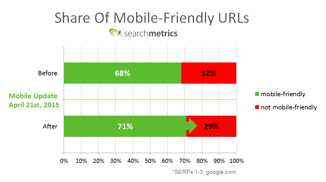
1. Mobile friendlier pages now appear more in the first 30 search results
The share of web pages Google considers mobile-friendly appearing in the first three search engine results pages (SERPs) increased by 3% after the update, accounting for 71% of the first three SERPS. Representation of pages deemed not mobile-friendly dropped down to 29% of the total after the change.
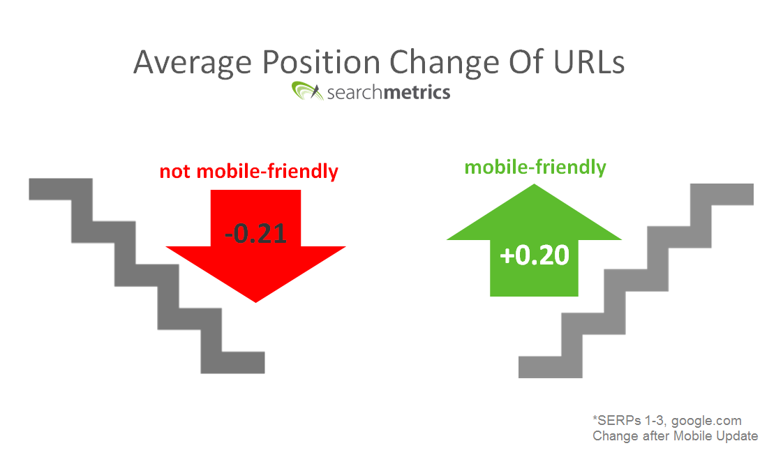
2. Mobile-friendly pages rank higher
The ranking position of pages not considered mobile-friendly fell by 0.21 positions on average after the update. At the same time, pages deemed mobile-friendly appeared higher in search results by 0.2 positions.
This might not seem like a huge difference, but given the large volume of keywords analysed, we believe that it indicates a significant change. This is especially true as we only included web pages that have stayed in the top 30 search results (i.e. the top three SERPs) after the Mobile update. If you add in the non mobile-friendly pages that have completely dropped out of the top 30, the average ranking loss would have been much higher.
Brands have followed Google’s advice
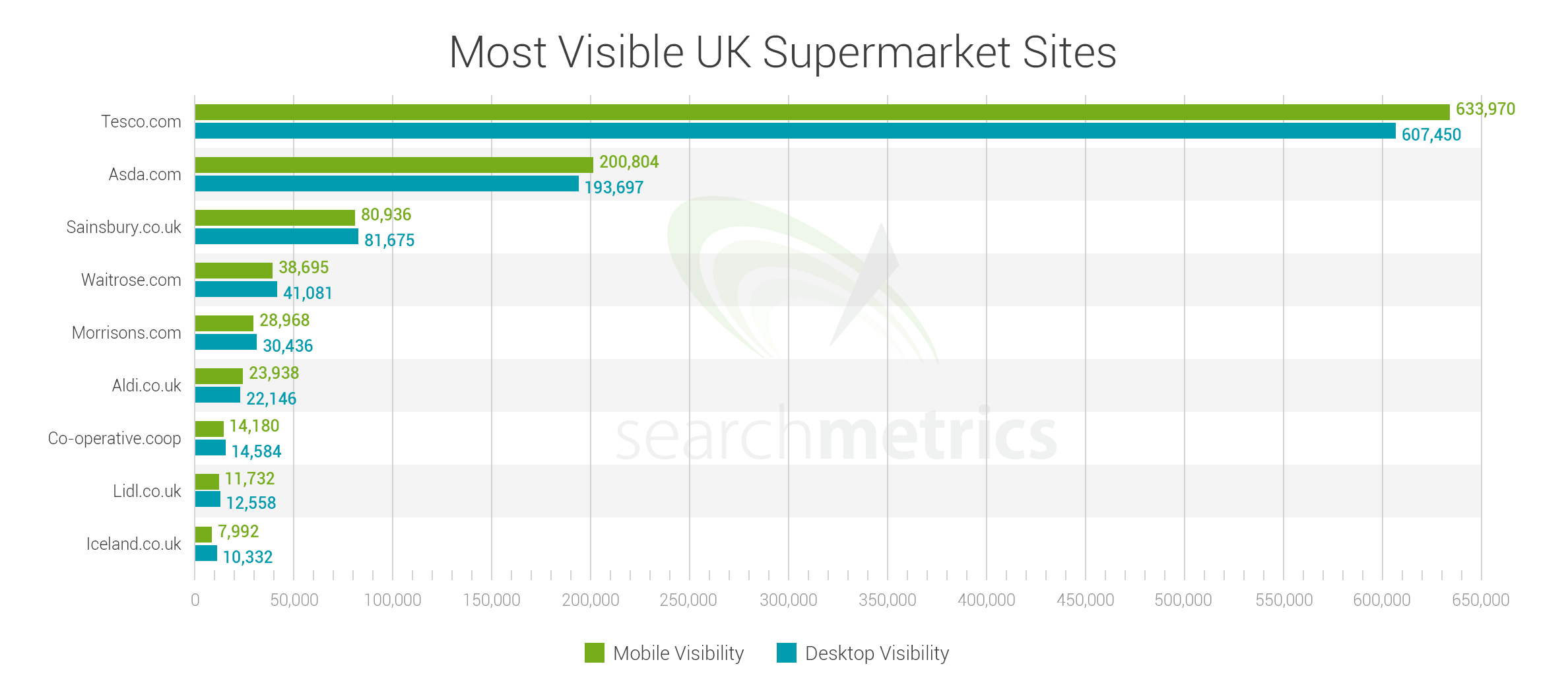
To assess the impact on some large brands, we analysed the mobile and desktop search rankings of top UK supermarkets and leading US online retailers.
In the UK, we discovered that Tesco.com was the most visible British supermarket in mobile phone searches, performing nearly three times better than Asda.com, its closest rival. Across the Atlantic, Amazon.com was the most visible US online retail site on phone searches, well ahead of Walmart.com and HomeDepot.com.
Importantly, the study found that sites in both the UK and US that ranked highly on phone searches were those that were already performing well in desktop searches – demonstrating that leading brands had already ensured that their pages were mobile-friendly.
In many ways, the fact that these brands have fared well after the mobile update should not be a surprise. After all, Google give plenty of warning before the change, and publicised the criteria it was going to use, which meant that the number of mobile-friendly URLs in the SERs had already increased by 4.7% before the actual update took place. Equally importantly, the growing number of consumers searching on phones and tablets also meant that it was bad for businesses to neglect their mobile performance, regardless of the Google update. Sadly, some companies were still caught off guard and need to check and update their sites quickly. Otherwise they’ll miss out on the 50%+ of searches from mobile devices, and potentially face a large decline in visitors and sales.