Now more than ever, companies need to be considering how to get the best slice of the mobile commerce pie. Today, 34% of the world’s ecommerce transactions happen on a mobile and next year it’s expected to rise to 47%, so it’s a business issue that can no longer be ignored. But in the fight for the best slice should you go for web or app? We have developed a decision matrix to help you decide. But first, let’s consider the pros and cons:
Why choose a responsive web solution?
A web solution can increase page views, decrease bounce rates and lead to a rise in conversion rates across visitors from mobile devices. It gives your customers the most consistent experience, from desktop, to tablet, to smartphone. It works best if you are looking to provide mobile-optimised browser access to the most important functionalities of the purchasing process. This option can have search engine optimisation benefits too, as Google takes into account the web approach and its responsiveness when ranking sites. So, if your website is your best selling tool, then optimising your service for mobile use is often a better option to building an app. It’s not always the best way of representing your site on smaller screens though and specific functionalities can be missed.
Why an app?
Building an app can make your service more accessible to a large mobile audience and provide much better ease of use. This is especially the case with more complex interactions. So the main advantage of choosing an app is that they can truly optimise the user’s experience via smartphones. It is also saved on their device, so more likely to be visible to your customers. However, for companies developing an app can be a complex, time-consuming and an expensive process, compared to opting for building a responsive web solution.
What happened at Spreadshirt?
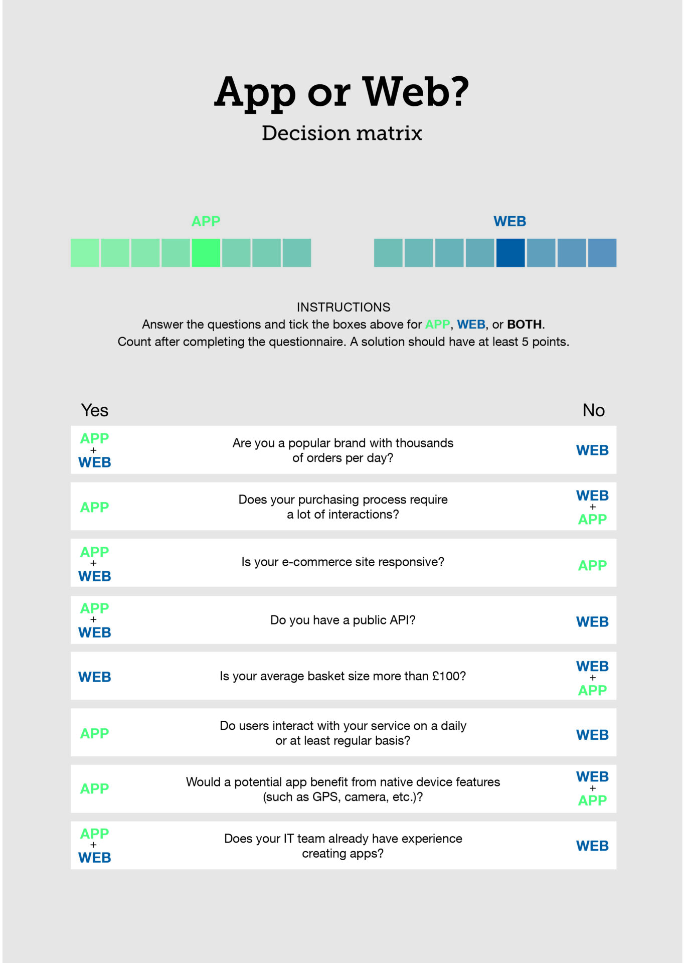
We’ve spent the last couple of years optimising our services for the mobile experience and our IT team built a decision matrix to simplify the decision process. Each question in the matrix (below) is relevant to ecommerce companies and will give you a web (W) or app (A) or both (W/A) answer. The best solution should have at least five points going for it.
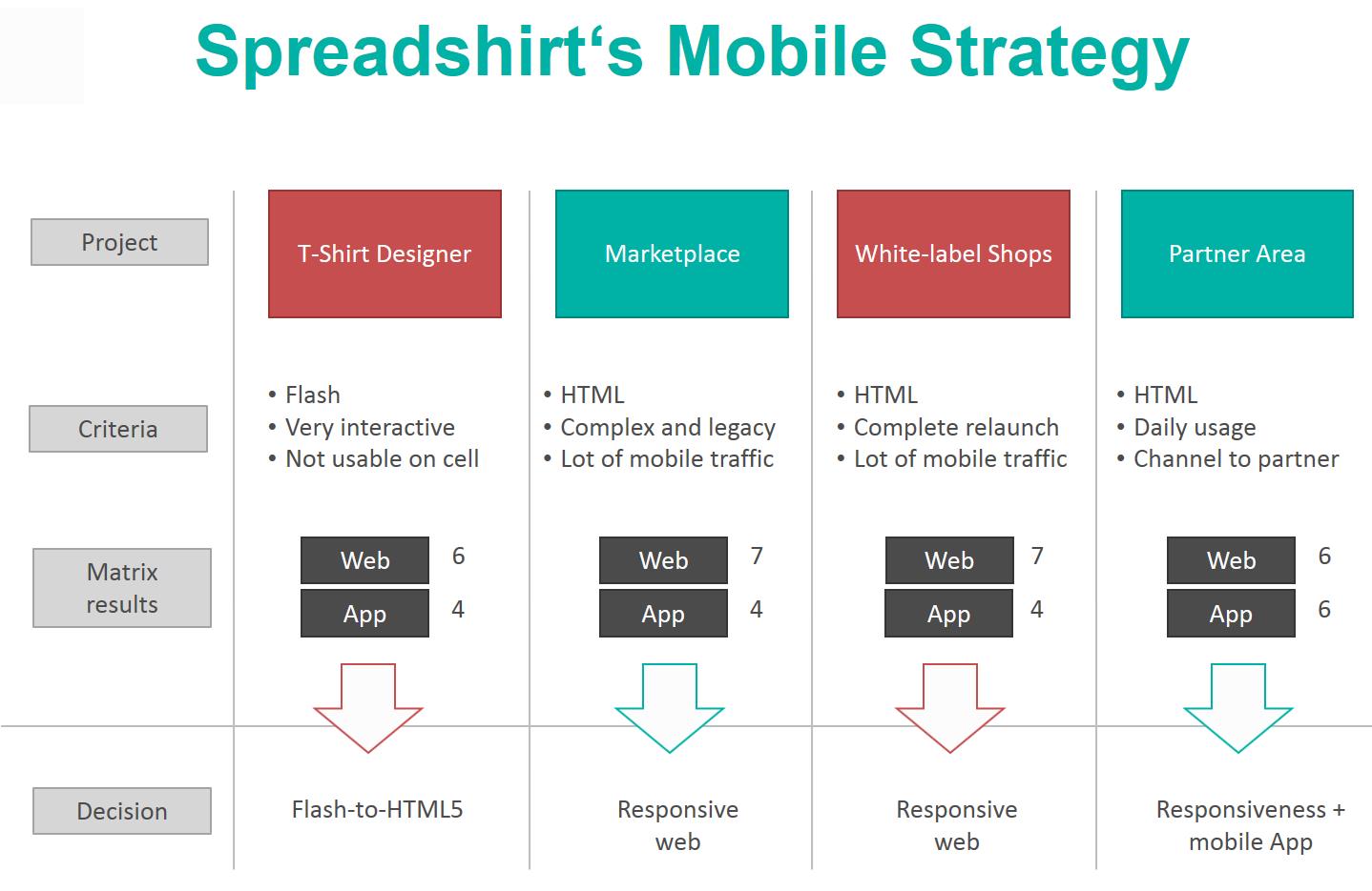
Spreadshirt is the only company to offer three different models on one platform: selling via marketplaces, via white-label shops, and via a create-your-own tool. So our mobile optimisation strategy consisted of four key projects: T-shirt Designer, Marketplace, White-label Shops and Partner Area (graph below).
T-shirt Designer
Our first web or app project was to update our old create-your-own tool, the T-shirt Designer, which was based on Flash and needed updating for mobile use. The decision matrix process resulted in the web option scoring 6 points and the app 4 (see graph). So, our focus went into creating a state-of-the-art design web tool based on HTML5, which responded to smaller screen sizes and touch devices, but retained an intuitive and exciting interface for users.
Marketplace & White-label Shops
The Spreadshirt marketplace and white-label shop system came next; each scored 7 points for web and 4 for app. Both were therefore optimised for mobile use with a responsive web solution. This meant that the user-interface and the mobile marketplaces’ search were simplified; less text, more symbols and a stronger focus on designs. A mobile-friendly, single-page checkout was also introduced and increased the conversion rate.
Partner Area
For the Partner Area, both the web and app scored 6 points. As a result, we decided on building a responsive web solution and developing a native app that partners could use to access data from their shops too. The Partner Area is the command centre for more than 70,000 selling partners worldwide. It allows them to manage their ideas and products and enables them to easily sell into new markets via impressive features, like international publishing and multi-product creation. Having the option of an app means our partners can benefit from a range of functions, such as enhanced statistics, push notifications and quick and real-time sales alerts straight to their smartphones. This wouldn’t be possible with just a responsive web solution.
Using our decision matrix, we have been able to look at each of our services and decide which approach is best for us, our partners and customers. We think other ecommerce companies will find our tool useful too. When it comes to deciding whether to build an app or a responsive web solution, the most appropriate choice really depends on your company’s end goals and which technology will help you eat a slice of the mobile ecommerce pie.