The world is on its feet. Order a meal, pay your utilities, get groceries, tog up in the latest styles… Talk, if you still do that! All on that little 5.5 inch piece of God-sent technology sitting in your pocket.
I can’t remember the last time I used a fixed line phone to call someone. And I wonder how we ever ended up meeting up with people without calling them a dozen times on the phone to confirm exactly where they were.
To be fair, experts have been warning businesses of the impending mobile wave for years now. However, it’s finally in 2014 that mobile phones finally overtook computers in terms of internet traffic. Which puts us in a position of no return. Our businesses better be prepared to bear the onslaught of smartphone wielding users or get left behind in the dust.
You can prevent that from happening by acknowledging and understanding these closely-linked fundamental shifts in technology and consumer behavior:
1. There’s No Escaping Responsive Design Anymore
According to a study conducted by Baynote and the e-tailing group, 55% of shoppers used their smartphones to make a holiday purchase in 2013. Only 34% used shopping apps to make purchases via smartphones or tablets.
In response, a large number of brands undertook the process of building mobile-only websites alongside their existing web based sites. These mobile-only sites typically had URLs that came in the “m.retailername.com” variety. However, this has clearly been a misstep in more ways than one.
Firstly, the existence of a web based site and another mobile based site means twice the work in carrying out any changes to the site’s content or appearance. Even a single change to a form or an image would need to be done on both the web based and the mobile based sites to maintain consistency in user experience.
A huge part of any digital marketer’s time is spent monitoring their website’s search rankings. By building a separate mobile site or serving device-specific pages, marketers will have to track two complete set of URLs for the same content. Worse, the victories that they gain by optimizing their websites for search go to waste when the same ranking benefits aren’t passed on to their mobile sites. There’s no choice but to do SEO for the mobile site from scratch, which means double the time, effort and costs.
Digital advertising becomes more complicated and expensive with your SEM and banner ads leading to two different sets of URLs. Tracking visitor traffic and attribution becomes a nightmare with multiple versions of the same webpage floating around. In short, a mobile website has turned into a logistical nightmare for many brands.
Enter responsive design.


Responsive Web Design (RWD) allows web pages to be displayed accurately on different devices with varying screen sizes. No more squinting to read text on your mobile phone or scrolling back and forth to read what’s spilled out of a smaller tablet’s screen. This eliminates the need to create and maintain two or more versions of your site.
In responsive design, the ‘grids’ that form the backbone of every webpage are expressed in terms of percentages instead of absolute terms like pixels. This allows the page to resize itself automatically without the need to manually create a new website for mobile screens. Images used in RWD are coded in units flexible as well, which allows them to resize to fit different screen sizes like the image of the girl on the Shopify homepage above. All of this resizing and reformatting is enabled by using media queries while coding. Media queries determine what type of device is being used, its screen size, resolution, operating system and so on to serve up the most optimal looking website to the user.
2. Payments “On The Go” have Become a Reality
If users are browsing online and shopping online, it obviously means that payment mechanisms have to follow suit as well.
While credit cards, debit cards, PayPal and their likes have already adapted to mobile payments, the real game changer this year is going to be payments supported by device makers that are eliminate the need to whip out a credit card or any other payment mode entirely.
A study on mobile wallet usage in the United States conducted in June 2014, shows that awareness of mobile payment systems is already high at 80%, while usage stood at about 32% of respondents. Users tended to be largely males, under 40 years of age.
An early mover in the mobile payments space, Google Wallet was launched way back in 2011, but saw less-than-enthusiastic adoption rates. Compare that to Apple Pay which received over a million credit card registrations within 72 hours of launch, and you can see that Google did not put their hearts behind promoting the Wallet. However, within a week of its launch in October 2014, Apple Pay has already become the leader in mobile payments.
One of the key benefits of mobile wallets is the elimination of need to carry cash or credit cards while shopping. As long as you have your phone, you’re good. Another key advantage is the fact that credit card and banking information is not shared with merchants and vendors when a user pays via a mobile wallet. This hugely reduces the risk of credit card fraud. Features like the Touch ID in iPhones and user specific PINs in Android phones ensures that even if someone else gets hold of your phone, they will still be unable to use your payment information.
All of these benefits combined with the fact that at least half of all shoppers carry under $20 in cash in their wallets and the incentives offered by banks to use mobile wallets; it’s only a matter of time before mobile payments become more mainstream in 2015.
Time to embrace near field communications (NFC) in your POS systems and get on board with the mobile payments revolution!
3. Mobile Advertising and Cross-Device Targeting are Intertwined
Emarketer’s numbers show that 19% of ecommerce sales happened on mobile devices in 2014. That number is poised to go up to 22% this year.
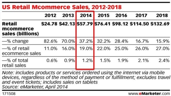
In other words, nearly a quarter of your online sales will come from mobile this year. This means if you’re not investing in mobile – from website design, content optimization to paid advertising – you’ll be making 25% less than you otherwise would have this year.
It’s not just users whose behavior is shifting to mobile. Google gave its official nudge to website owners to move to mobile friendly versions of their sites in 2014 by declaring “mobile friendliness” to be a definite ranking factor.
Social media is going mobile too. Two out of three users access social media via mobile devices. TechCrunch christened Facebook a “mobile advertising company” when it emerged that mobile ad revenues made up 53% of their Q4 earnings. Over 900 million Facebook users access it via mobile devices. About half of those users access it only via mobile devices.
Native advertising, the new darling of the advertising industry, is mobile-leaning as well. Native ad CTRs for mobile ads stood at 1% leaving desktop native ads with CTRs of 0.15% far behind. Social media will be the biggest beneficiary of the native ad boom in the form of Promoted Pins, Sponsored Tweets, Sponsored Stories, and so on.
What’s even more interesting is the growing importance of cross device targeting. Cross device targeting is basically a step up from basic retargeting. Here, a unique identifier is used to track a user across multiple devices they own – laptop, mobile, tablets. Ads are shown to users based on their behavior across all these devices. Cross device targeting will truly come of age in 2015 with 54% of all retail sales in 2015 expected to happen directly online or happen offline after being influenced by digital advertising, according to Forrester Research.
What this boils down to is the urgency that you need to inject into your advertising and go mobile today. From investing in paid search ads on mobile to mobile ads on social media to native ads to using cross device targeting for your digital ads, your horizon needs to broaden this year to accommodate mobile advertising as a key contributor to your overall revenues.
4. Email Campaigns Are Increasingly “Mobile-First”
Email has been an unsung hero for long. For every dollar spent on email marketing, businesses get $40 back as revenue. No other marketing platform can hope to match it in terms of ROI.
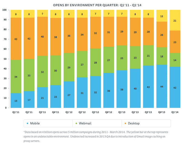
From offering the highest ROI to offering a reliable source of revenue for businesses big and small, email marketing is slowly finding its day in the sun. Even with email, mobile has emerged as the place to be. Email has emerged as the most popular activity on a smartphone with 78% of users ranking it as their no.1 activity in IDC and Facebook’s “Always Connected” study. Experian in its Quarterly Email Benchmark Report states that 53% of all email opens happened on mobile devices in Q3 of last year.
Mobile open rates have been consistently growing since 2011, while the same period saw a distinct drop in webmail opens.
Now you probably already carry out desktop-focused email marketing campaigns for your brand. The shift towards mobile means that you’ll now need to tailor your email marketing to the mobile audience.
This means, keep the subject lines short to help the entire subject to be displayed on a small mobile screen. Research shows that subject lines with 6 to 10 words have the best open rates. Aim for below six words in your mobile emails to ensure readability.
Just as you would create a responsive website for your brand, invest in making responsive email layouts that render well on phones. Make the CTA buttons larger and offer more white space in your emails than before. This prevents fat-finger syndrome on mobiles, allowing users to read clearly and click on the CTA thus improving your mobile CTRs.
Wrapping Up
The rapid growth in mobile usage not only holds huge promise, it also brings with it a unique set of challenges. In 2015, the hope is that marketers like you and me are able to identify the right cues and bet our time and money on trends that will outlast our immediate actions. Here’s to a super mobile 2015!