Spot the difference
Mobile websites should be different – but not at the expense of both brand and user requirements.
Mobiles: we all have them – in fact the UK has enjoyed over 100% percent penetration for several years now – and we all use them very differently. Texting and voice are, of course, the most popular activities (we sometimes forget that mobiles started life as phones) but the proliferation of smart phones has moved these simple devices into hugely sophisticated devices with lots of potential.
And now, of course, we have tablets – sitting somewhere between a smart phone and a PC. Although only just out of the early adopter phase, some of the more ambitious pundits are predicting that tablet sales will out-strip those of desktops by 2013. But they won’t replace desktops and laptops, they will be an addition to people’s burgeoning arsenal of web-enabled devices.
All together now…
A growing number of people now have a smart phone, a tablet, a laptop and a desktop – all very different machines with different software and operating systems – and they are used in very different ways. Even though people may use their desktop and laptop differently, they are, in essence, the same thing – users’ choices are based on pure convenience; the experience is very similar and on the web it is exactly the same.
The web experience on mobiles and tablets, however, is entirely different. People use browsers on their mobiles to snack and tend to opt for apps when they want to feast. Initial searches, occasional information requirements and the odd service need can be provided by a browser, however, in an increasing number of cases, frequent use is best served by an app.
TV guides, classifieds, auction sites… these are all fast-growing mobile web categories and offer the type content that require frequent access – the best of these offer apps whereby the user can immediately access rich and useful information designed for their device. But what about other types of mobile sites? How do they offer their users an experience – either one-off or regular – that satisfies their requirements?
Same old, same old…
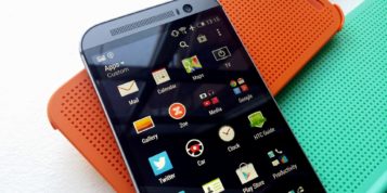
Mobile websites tend to look the same – most homepages present an image with a horizontal list of navigation directly below it. This navigation leads to what is considered to be the most useful (probably the most popular) content from the main site. Tone of voice rarely differs from the main website, content is often not ‘mobilised’, and brand and personality are virtually non-existent.
Is this a question of arrogance from brands assuming that users are already familiar with their sites through full web experiences or is it ignorance from agencies who simply copy the other mobile sites they see in the same category? The answer is possibly a bit of both. Users’ mobile web expectations are now out-stripping what their devices are delivering – apps deliver a brand’s look and feel, appropriate tone of voice, useful and timely content, and practical tools, but mobile sites very rarely do the same.
There may be a degree of complacency by assuming that most users will opt for apps (at the moment, app and browser access are evenly split), however this is by no means certain. Smart phone proliferation doesn’t necessarily mean smarter users. As this new generation of phone becomes ubiquitous, not-so-smart users will also have them, users who really only want to speak, text, take the odd photo and briefly visit the web on occasion.
Taking advantage
So it is probable that we are heading into a situation where maybe half of all mobile web experiences are unsatisfying and whilst brands realise that mobile is important, very few really know what to do with it.
Mobile users want easy access to timely information, entertainment (mainly through apps) and to know who or what is nearby. Can your brand satisfy any of these requirements? Probably not – and you probably don’t need to. Most brands cannot naturally start producing news, developing games and telling their mobile users who else nearby uses the same brand of toothpaste. You can, however, think about your user’s mobile experience, given the mobile space in which your brand lives.
When thinking about your brand’s mobile strategy, you should consider a few key things. How can you design a mobile web experience that takes advantage of the attributes of the device, such as location awareness, one-click phone calls or an integrated camera? How can you design a mobile web experience that prioritises content and messaging given the likely context in which the user is using the device (on the move, time poor, killing time)? And how can you design a mobile web experience that doesn’t dilute your brand personality?
A small screen doesn’t necessarily have to mean a tiny experience. A small screen means a different experience… but an experience nonetheless.