Overview
In order to get the most out of your marketing investment in any channel its worth understanding the essential role that conversion and user experience optimisation has to play.
In this article I’m addressing the optimisation from a search engine result page to persuading a user to call or click into the first part of a lead funnel. I’m not addressing the optimisation of the lead funnel as this would be another article in itself, being another important part of the process.
Outlined below is a lead optimisation checklist from the SERPs to an on page action.
Specific Target – Know your goal and your marketplace
1. Know your Page specific customers and their needs
It’s important to understand what your customer is looking for so that you can develop the page to catch their interest and solve their problem. Profiling your target will enable you to more easily provide the right solution. This is also true for search engine optimisation, when looking to generate targeted traffic through keyword themes that supports the user’s needs and or interest.
2. Define your Primary CTA
Defining a primary CTA will enable you to present the page with a biased towards this action and will increase the percentage of users following that route. You can have more than one Call to Action, however ensuring each pages has a primary CTA will present more focus and less confusion.
CTR Optimisation: SERPS
3. Title Tag
4. Meta Description

Both the Title Tag and the Meta Description are in effect your Adcopy and will be your opportunity to drive users to your site. Include a call to action and customer driven USP’s in your description.
5. Rich snippets – star ratings
Personally I have seen star ratings increase the Click Through Rate, CTR by 60% week on week and you can use both individual or aggregator reviews to do this. Google offer an explanation of how to set these up: https://support.google.com/webmasters/answer/146645?hl=en&ref_topic=1088474
6. Google Authorship
Images, videos and star rating etc. all positively increasing attention on your organic “ad” which increases the click through rate to your site. Google Authorship where applicable presents the same opportunity for your blog posts, placing the authors image next to your listing.
https://support.google.com/webmasters/answer/1408986?hl=en&expand=option2
Lead Conversion Optimisation: Landing Page
Once your potential customer has clicked through from the SERP’s and they land on your page. You want the user to stay on the page and complete your call to action. The following steps optimise your landing page for increased conversions and a greater user experience.
7. Clarity of Design
In fairness I have seen some beautiful sites with terrible conversion rates and some ulgy sites converting very well. But when it comes to increasing conversions, page clarity seems to offer the highest value from the design. Clear and simple converts.
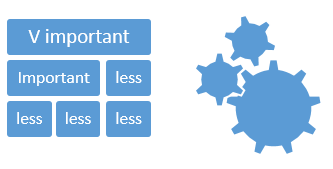
8. Hierarchy
A good way of looking at your site is in terms of hierarchy. We all unconsciously perceive relative importance as shown in the examples below. Therefore ensuring that your landing page respects this understanding can help you to gauge the likely focal areas and associated actions.
9. Engagement
The more you empathise with your user, creating an understanding of their needs or desires you can work towards maintaining their engagement whilst on page and where possible drive an emotive action. For example the use of images is often overlooked outside of ecommerce sites. There is lots of research which supports the following and should be considered when building your lead generating page:
a. Larger images work.
b. People buy from people i.e. humanise the web pages with faces or people.
i. Where there are people, viewers tend to follow the person’s line of site so use this to your advantage where possible.
c. Feature a customer.
d. Tailor images to your customer demographic.
e. Tie images to the product or service.
f. Buttons are images – Getting the Call To Action text on buttons correct can triple your Click Through Rate.
10. CTA
Including strong Call To Actions are essential when you are looking to invest in driving traffic to the page. Pages can have multiple calls to action although having a primary focus will give your page more direction and focus.
11. CTA Colour
When selecting the colour for your CTA, it must stand out from its surroundings, the background and any other surrounding images. Ideally you should choose a colour which contrasts with colours on the rest of the page and catches the eye so it will likely be a bright colour.
12. Space
The use of white space can easily be underestimated, as including clear space around your calls to actions allows the viewer to see it more clearly, opposed to a busy and cluttered page with many elements all fighting for attention.
13. Multiple CTA’s if long page
If you have a long page with a call to action above the fold and a lot of supplementary information below the fold, remember to include multiple calls to actions on the page, so that user’s attention can be focused to achieve your goal.
Following the above approach will help you to plan out your goals, understand your customer and their desires, and tailor the page to increase engagement whilst funnelling their attention to achieve the desired result.